Lion Review by Goondaba

On July 20th, 2011 OS X and iOS gave birth to Lion, the latest and… latest from the überminds in Cupertino.  There's some cool stuff in the newest update to OS X, but my initial reactions were of the less-than-amused variety.  I thought I'd jot down some of my impressions while using Lion for the first few days; the laughter, the sorrow.

First of all, I installed Lion on the Core 2 Duo aluminum unibody I had lying around.  I thought I'd test Lion out on the lappy before throwing the cat some big, beefy iMac. Alright then, let's get to it.

Day 1

I'm in between like… and rage.  

Scrolling

First of all, the very first thing that happens when you boot into Lion, is this giant dialog shows up telling you, "Hey, we reversed the way scrolling goes. Why? 'Cuz screw you that's why." And of course you can turn off this behavior to go back to the way things were, but you have to un-tick the box that says "natural scrolling" in the trackpad preferences. Meaning the way you like to scroll is unnatural.  Which means they probably ran tests with iPod touch users who had never seen a computer before... users who were dumbfounded by the über tech that is, the TRACKPAD.  So that's just your welcome into the new hotness.

Finder

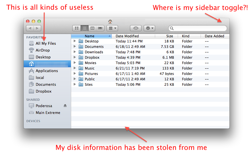
I had to flick a few settings just to get my Finder window functional again.  By default, it throws an item into the side bar called "All My Files" and makes it the default view for new open windows.  "All My Files" is literally… all your files; regardless of where they are on your filesystem.  Who the heck would find that useful? That's why I put crap in folders.  Folders = crap holders.

So I fix that in the preferences.

After getting rid of that, I notice Lion has gracefully removed the bottom of the Finder window showing me the number of items in the current directory and free disk space.   That's useful information; I want to know how much space I have free to load up with lolcats. So to get that back, I have to go up to the View menu and select "Show Status Bar".

So I fix that in the preferences.

And to top it off, my friggin library folder isn't visible, because apparently I shouldn't be messing with that witchcraft.  So to see your library folder, which is totally there, you have to go up to the "Go" menu, (which, what self-respecting user ever goes to ?) hold the option key, and THEN you'll be graciously shown the option to see your own Library folder.  It's like XP where you went to your settings folder and it asked you, "These files are hidden. are you sure you want to see them?"

So I fix that in the… no wait, what? There's no preference for that?! $@#%#*&!

Spaces

I use spaces all the time on my Snow Leopard iMac.  I like seeing at the top on the menu bar, the number of the screen I'm on.  I also like being able to organize my screens in grids.  I also like being able to go to the spaces preferences and choosing how many spaces there are.  

But apparently I like all the wrong things, because those all went away.  There's no option to show the screen number you're on anywhere; you have to go to the Mission Control app to see that.  And now, you can't organize spaces in grids; you get one long, linear streak of spaces.  I really liked being able to pop around the grid; up, down, diagonally, and in linked-list back-forth. Sigh…

Safari

Full-screen Safari is pretty cool.  It feels very snappy and oh man why did they have to mess with my Spaces?!?!

Day 2

Snap to Grid

So this is something relatively minor, but Lion decided to kill my snap-to-grid preference for items on the Desktop.  A simple change in the Desktop view options under the "Arrange By" menu, which Lion now calls the "Sort By" menu.  Because apparently the word "arrange" was too cryptic.

Dock

While the Dock doesn't look any different at first, I heard buzz about something having to do with the indicator dots… you know, the little blue dots that show up in the Dock under applications that are running.  Well there's this tick box in the Dock preferences called, "Show indicator lights for open applications".  Why would that option even exist? Well, apparently the default behavior is to NOT show the indicator dots.

As was explained in the very thorough ArsTechnica review (which I strongly suggest you read), when you quit an application, Lion reserves the right to show the application quitting, but keep the application's process alive in the background.  Lion also reserves the right to quit applications it determines you're not using.  So, in a very real sense, those blue dots don't mean as much in Lion.

Individually, these all seem like minor changes.  But all together, Apple seems to be messing with some things that haven't changed in computer-age eons; stuff that hasn't changed since System 1.0.  Things like the concept of a "running" application.  Ah! And messing with the fundamentals brings me to the scrollbars…

Scroll Bars

I don't want to say too much about this, because it seems to have been mentioned in every review I've read thus far, but… the scrollbars.  By default, Lion only shows you the scrollbars when you're scrolling.  This works great on an iPhone, but on a laptop/desktop those scrollbars are indicators of where you are in a document, and the relative size of the document.  If the scrollbars are hidden, then that information is no longer readily available to you. And that's not cool Lion. Not cool.

You can change this by going to the "General" pane (renamed from the "Appearance" pane) in the preferences. By this point, there are quite a few toggles to switch to get the system back to just useable.

Speech

Alright, so most of this has been griping so far, but there are changes in Lion that I think have changed for the better.

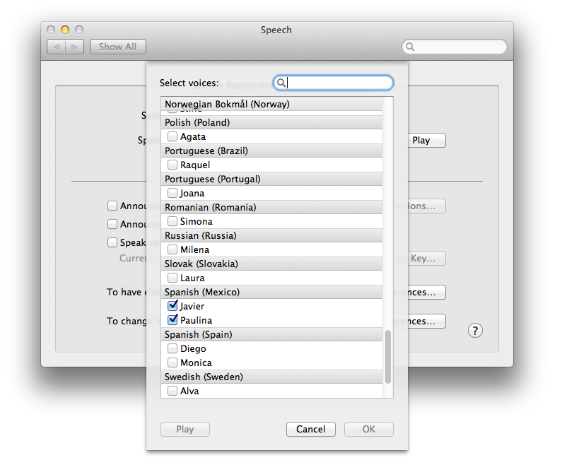
Lion has some MUCH improved voices to choose from, and I do mean choose.  In Snow Leopard, if you went to the "Speech" pane in preferences to pick a synthesized voice, most of the choices would look familiar to someone who hadn't used a Mac since System 7. But now when you go to pick out some new voices, you're presented with an array of high-quality voices, in different languages and locales.

About this Mac

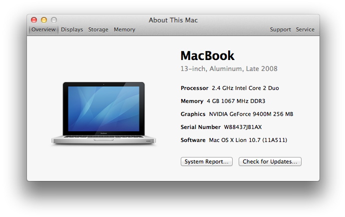
Selecting "About this Mac" under the Apple menu shows you the same dialog you'd see in Snow Leopard, but the "More info…" button now takes you to "System Information".  It has much of the information that you would have found in "System Profiler" (though if you still want to see the classic profiler with all the additional information, you can click the "System Report" button in this window).

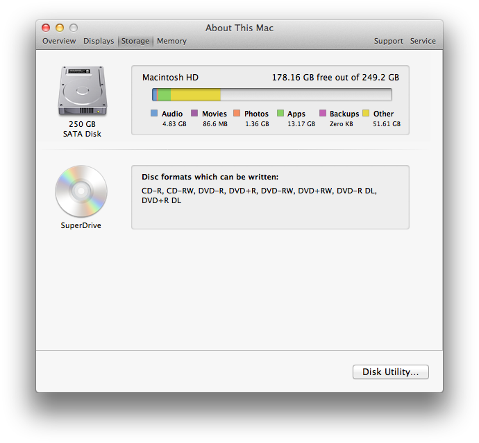
This should prove more useful to people who just want to grab some quick information on their system, but what I like most about this is the added view for Storage.  Now you can view the usage of your storage space by content type, à la iTunes iPhone usage view.

Day 3

Print Dialog

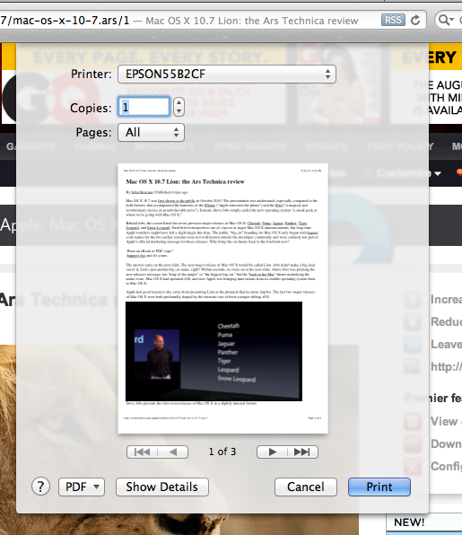
The default print dialog has been reduced to a shadow of its former self.  Actually, I don't have much of a problem with this change.  All the dirty printing details can be gotten to by the "Show Details" button. Making things easier up front, and putting the details another click away; a common theme in Lion.

Command-Tabbing

Okay, now this is a big deal for me. Traditionally, you've been able to hold down the Command (or Apple) key and Tab to cycle through open applications.  If you try that in Lion however, it won't work.

Oh, you'll get the list of open applications alright. But when you then select an application to go to, nothing happens; it doesn't take you to the application you've chosen. Which makes command-tabbing through your applications pointless.  So this is the first thing in Lion I've encountered that actually feels broken.

Harumph.

Front Row

It's not a bother to me really; I knew it was coming.  But just in case you were really fond of Front Row, or "Fronty", as I call him... I regret to inform you that Uncle Steve drove him out to a farm with lots of open space where he could run around forever.

Dashboard

By default, Lion now puts Dashboard into a separate screen within Mission Control, putting it two gestures away from the desktop.  You can restore Dashboard's pre-Lion behavior of fading over the current screen in the preferences for Mission Control.

I don't get the usefulness of burying Dashboard within Mission Control... when I want to use a widget in Dashboard I just want to see some information, and get out in a couple of seconds... kind of like a rest-stop map in a shady state.

Method for Detecting Drag Events in the Canvas Element on Touch Devices by Goondaba

I was recently asked about being able to detect a drag event within a Canvas element on a mobile device. By default, if you try dragging on a web page with a canvas element, the entire page will shift and the touch input is lost.

This behavior can be overridden to allow capture of drag events. The basic strategy is to disable the touch events and capture them, and then respond to them manually.

Because the method to capture the touch input uses general Webkit directives, this solution will work on both iOS and Android devices.

You may view the example on your mobile device here

References:

"Touching and Gesturing on the iPhone"

"Canvas Tutorial"

AppleTV by Goondaba

Motivation

 I recently acquired one of the new AppleTVs, and was excited to see what one of these could do.  I have an 802.11n wireless network in the apartment, and I don’t have a media-centric game console or an existing streaming media box near my TV, so the AppleTV seemed like a great fit.

Un-boxing


 The packaging itself is something to behold; the AppleTV comes in one very diminutive box.  And once you tear into the small box, there’s an even smaller piece of hardware with the most tightly wrapped power cord you’ve even seen.


Initial Impressions

 Setup was a snap. You just plug in the power cable to the wall and the HDMI cable to your HDTV, and you’re good to go.  Once you start up the AppleTV, it’s just a matter of connecting it to your wireless network and putting in your Home Sharing information to get your device ready to play shared content on your local network.

So setup was easy, but I spent a while looking for some sort of volume control and couldn’t find it.  Apparently, there is no volume control, so you just have to adjust the volume of your TV or speakers.  Although, if you’re using the AppleTV as Airplay speakers, you can adjust the volume via iTunes on the host computer.

Main Features

This was my first experience with an AppleTV, so I didn’t have the previous generation of AppleTV to compare it to.  I was mostly comparing the AppleTV to using Front Row on a Mac, and the experience was, for the most part, very similar:


Movies: You’ve got movies; you can view trailers and rent movies in HD from the iTunes store.

TV Shows: You can rent shows in HD.

Internet: There’s a lot going on under the Internet tab.  You can view YouTube videos from the internet tab, which makes sharing videos with groups of people simpler.  Additionally, you are able to watch or listen to podcasts, access your Flickr pictures, and listen to the radio stations available in iTunes.  You can also access your Netflix account using the new Netflix interface and MobileMe stuff (I didn’t test these since I don’t have a Netflix or MobileMe account).

Computers: Here’s where you can access all the media available on the machines in your local network.  After entering your Home Sharing information in the AppleTV and enabling Home Sharing on your computers, you’re able to view all your iTunes content on your HDTV.

Settings: Where you get to configure everything from network settings to your favorite style of slide show.

Airplay

New in this version of the ATV is the Airplay option, which allows you to access any speakers hooked up to your ATV via iTunes on any other computer on the network.  This is pretty straightforward, and works very well.

Interface

The AppleTV comes with a handsome remote that is good for most functions, but there are some things which really need a keyboard for.  Having to thumb through an online keyboard using the included remote isn’t very speedy, for example.  But that’s not a problem if you also happen to have some iDevice nearby, like an iPhone, iPod Touch, or iPad.

Using Apple’s Remote app, you can use your touchscreen device as a remote to your AppleTV.  For navigation, the Remote app uses gestures to make its way through the ATV interface, and when necessary pops up a keyboard, which makes typing text into search fields much easier.

External Media

My biggest concern with the ATV was wondering about whether it would stream content from stuff I had on external drives.  Movie files are big, so I don’t keep them on my computer’s main drive, I keep it all on an external drive.  So I was glad to find out that as long as it was in the iTunes library, the ATV could stream it.  All I had to do was option-drag my content from my external hard drive to my iTunes library to make iTunes aware of my external media (option-dragging makes iTunes aware of content without copying it to the iTunes folder).  Of course, this only works for stuff that iTunes will accept; meaning video files in Quicktime friendly formats.

Bugs

Though it’s tiny and shiny, it’s still a computer, and therefore is still susceptible to bugs.  I’ve only come across two in the time I’ve spent with the device.  Firstly, I’ve been able to crash the ATV by trying to play large files; I tried streaming a 1080p version of Big Buck Bunny and only got a few seconds of it before the ATV crashed - a simple unplugging-and-plugging was required.

Secondly, when waking the ATV from sleep and playing a song using the Remote app on the iPad, I’ve noticed that the first song I tap isn’t played immediately. Rather, I have to tap the song, then tap a second song.  Then, once the second song starts playing, I can go ahead and tap the song I originally wanted.  Weird.

Overall

I’m very pleased with how the AppleTV has performed, and think it’s a great addition to the living room.

Magic Mouse by Goondaba


The motivation: I recently moved to a new place and got a nice desk; a desk which I decided I'd like to keep free of as much clutter as possible.  So besides finding places out of view to store my USB hub and external hard drives, that left... the mouse.  

I had been using a Microsoft Comfort Optical Mouse 1000 (gdgt) for the past few years.  I loved it; it was comfortable in the hand and made navigating my screens a breeze.  But the cord hanging out the back seemed a little strange on the new desk, so I figured I'd find something wireless.

At first I assumed I'd just get a wireless Microsoft mouse; despite their track record in other fields, Microsoft seems to have nailed making a mouse that fits comfortably in your hand without having to put any thought into it.  But I also wanted a mouse that used Bluetooth, so I didn't have an RF dongle to worry about carrying around.  Though the Microsoft mouse I was looking at looked... fugly (gdgt).  I wasn't crazy about the design, so I thought about getting a different make of mouse.

I'd been curious about the Magic Mouse after reading reviews from those who either loved or hated it.  So I went ahead and got one to try out.

First of all, it took some getting used to.  You can't hold it the "lazy" way you would grasp a Microsoft mouse.  That is, you can't hold it by laying your wrist flat on the desk, with your palm resting on top.  The Magic Mouse is pretty thin, and holding it that way would become uncomfortable pretty quickly.  Rather, you have to operate it with your elbow resting on a surface so that your wrist can float above the desk and curve downwards.  Not only does this give the best angle for holding the mouse, it also makes it easier for your fingers to trigger the touch controls.

I haven't gone crazy with the touch controls yet, and I plan to go over that in a future post (once I've been able to play with some third party tools that enable additional features for the Magic Mouse), but the basics of clicking are similar to the Mighty Mouse (and I've been playing with those third party tools to fine-tune the clicks just the way I like them).  And the scrolling is pretty nifty; you can scroll through a large list in iTunes or a large page in Firefox in a snap.

Don't get me wrong... there were a few days when I was still getting used to the Magic Mouse when I would look over longingly at the box in which my old mouse now sat.  But after about a week, using the Magic Mouse has become second nature, and it's definitely helped in clearing out the clutter on my desk.  I'm not sure if it's magical, but it makes for a pretty good mouse.

UIActivityIndicatorView Without Threads by Goondaba

So I recently ran into a snag while trying to implement a UIActivityIndicatorView.  There's a great and simple explanation of how to do it on the Apple Developer forums.  This is how you're supposed to do it: you tell the UIActivityIndicatorView what method should be run in between starting animation and stopping animation.

My problem was that the code to be run in between starting and stopping animation wasn't in a method I could point the UIActivityIndicatorView to.  The purpose of the pinwheel animation was to let the user know that their iPhone hadn't died while trying to render Javascript.

You see, the app I was working on had some HTML tables that needed to have some work done on them before they were decent for public consumption.  So, that work was done with a Javascript and when the table was ready to be seen, the table would be made visible to the user.  But, until the table was ready to be seen, the user was just looking at a blank screen for a few seconds.

Anyway... I needed a way to start a UIActivityIndicatorView when a view was loaded and then be able to hide it, without the use of threads.  However, I couldn't find any good solutions.  So this is what ended up working for me:


 In the view you want to have the UIActivityIndicatorView to show up in, go to your interface (.h) file and define the UIActivityIndicatorView:

Now open up your NIB (.xib) file in Interface Builder.  Plop a UIActivityIndicatorView onto your view and place it where you want:

 Go ahead and make the connection to the UIActivityIndicatorView from the IBOutlet we just defined:

 Now, with the UIActivityIndicatorView selected, go to the Attributes Inspector.  There, make sure the "Hide When Stopped" and "Animating" checkboxes are checked:

Save your NIB and go to your view's implementation (.m) file.  What we've done so far is set up a UIActivityIndicatorView to show up as soon as your view loads and begin spinning, but now we need to stop it when we want.  So now just tell the UIActivityIndicatorView to stop animating when appropriate:

CyRide App by Goondaba

Ever been to Ames, IA?  Ever needed a ride somewhere?  The CyRide bus system is a nifty way to get around town, and now there's an equally nifty way to see the bus schedule.

CyRide is an app that lets you view the schedules for any particular day, right from your iPhone or iPod Touch.  Browse to see when the bus is coming, and check out the Twitter feed in seconds.

This app has been discontinued.